Online Health History
Empowering patients to share their health history digitally with clinics
CASE STUDY • 6 min read
Employer
Timeline
Apr 2017 - Aug 2020 (3 years, 5 months)
Deliverable
Web application
How I helped
- Oversaw the entire design
- User research and usability testing
- Storyboarding & journey mapping
- Wireframes, mockups & prototyping
- UI design & style guide
- Customer support for clinics & patients
Results
- Reduced admin time by 15 min per patient
- Data from surveys indicated that it was a better experience for patients
Context: The overwhelming patient journey
Imagine that your hip has been in pain for a year, and that you finally have an appointment to see a specialist at St. Paul's hospital. As you enter the room, you feel a mix of relief and anxiety in finding out the cause of your pain. The specialist asks you a few questions and then gives you the answer: you need to replace your hip.
I need to what?!
Back at the reception area, the office assistant hands you a bunch of forms. “It would be best if you could complete these now, so I can schedule your surgery as soon as possible. Otherwise, you’ll have to come back to drop them off or fax them to us.”
You nod and take the forms to an empty chair in the corner. The first form asks about your health history - but you don't understand half of the medical terms. You look towards the office assistant for help, but she's busy assisting another patient. Then your phone buzzes and reminds you that your parking expires in 10 minutes.
A wave of emotions suddenly overwhelm you. Shock at the news of surgery, uncertainty for the future, and anxiety for having to complete these papers under time pressure - you simply don’t even know how to continue.

Photo by pressfoto on Freepik
Digitizing the paper health history form at St. Paul’s hospital
In 2017, our company (called New Hippo Health at that time) partnered with St. Paul’s hospital to see how we could improve the experience for surgical patients. I joined the company after the team came to the solution of digitizing the paper health history form, allowing patients to complete their health history online.
However, the completed health history form was only one step in the journey for the patient, and an even smaller part for all the healthcare staff who would interact with it - the specialist, their office assistant, the screening nurse, etc. We had to ensure that digitizing the health history form wouldn’t disrupt existing workflows, but instead benefit all the parties involved.
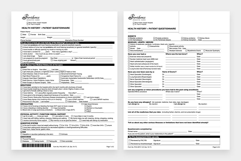
The paper health history form for surgical patients at St. Paul's hospital
Understanding the users involved
Through user interviews, we quickly established 3 core users who interacted with a patient’s health history form. They each had their own unique challenges and pain points.

Photo by Freepik
Patients
Aside from physical discomfort and being in a vulnerable emotional state, it was overwhelming to fill out the form under a time restraint, especially when it contained medical terms they didn't understand.

Photo by KamranAydinov on Freepik
Office assistants
Amongst all the phone calls and constantly having to juggle tasks, it was a challenge to help patients fill out the form in-person. Yet if the patient didn't complete it in the office, it was very tiresome to chase down the patient for the form in order to schedule their surgery.

Photo by Racool_studio on Freepik
Screening nurses
Having to decipher illegible writing was one thing, but receiving incomplete health history forms was the biggest pain, as this meant having to follow-up with patients or their healthcare providers to get more information. This often resulted in a frustrating game of “phone tag.”
Designing the solution
Keeping the needs and pain points of our 3 core users in mind, we ensured that our design encompassed the following:
- Providing medical definitions in layman's terms
- Asking follow-up questions only when necessary
- Allowing the patient to submit the questionnaire only when it was 100% complete
- Providing a clear indicator of the status of the health history questionnaire
- Establishing the tone and visual style to be caring, approachable, yet professional
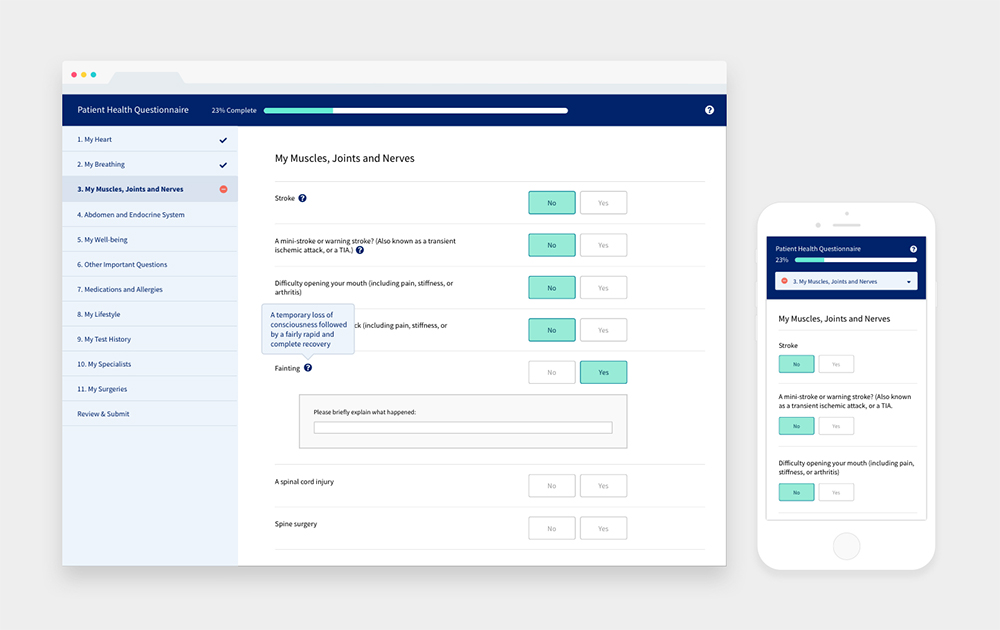
The patient health history questionnaire on desktop and mobile
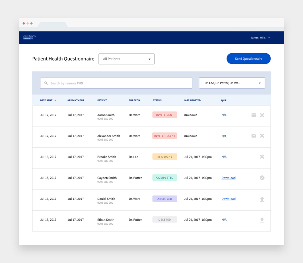
The office assistant's platform to monitor the completion of the health history questionnaires
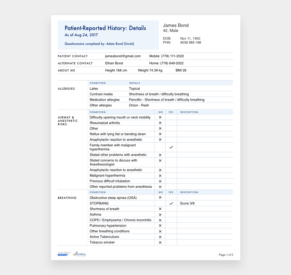
A printable version of the completed health history questionnaire for screening nurses
Addressing concerns that emerged from a paper to digital transition
Through multiple iterations of our Axure prototype, we got valuable feedback from our stakeholders and user groups, especially on concerns that didn’t arise when the health history questionnaire was a paper form.
The biggest one was privacy and security. Not only did our platform have to meet the technical standards, but it also had to give the perception that it was extremely secure to users. We achieved this by:
- Explaining the need to create an account to securely store and access the patient's personal information
- Removing Facebook login for account creation
- Having the patient verify who they were before completing the questionnaire
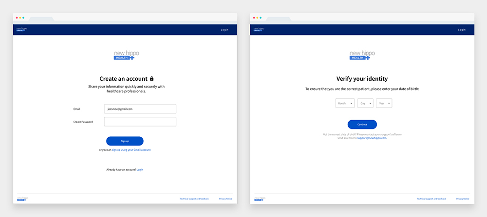
Workflow of creating an account, and then verifying your identity by your date of birth
The outcome: Making everyone's workflow more efficient and enjoyable
We first launched our solution with a pilot group - the Colorectal Surgery Office at St. Paul's Hospital. During this pilot, we constantly got their feedback on what worked and didn’t work, iterating and improving the design. They told us it was the first time they felt heard by a software company, and were amazed at how we could quickly make changes to the solution to address their needs.
Over time, they slowly discovered that sending out the health history questionnaire prior to the appointment was not only more efficient for them, but also for the patient. Patients loved how they had time to think through and provide a more thorough health history at home, where they had all the information. An unexpected benefit was that patients could now easily reuse and share their health history with other providers!
Screening nurses also liked how this new health history questionnaire was thorough and complete - they no longer had to hunt down patients for more information. Through data collected from metrics, we discovered that our solution reduced admin time by 15min per patient!
Lessons learned: Designing for a large-scale organization
Designing a product for users within a large-scale organization is extremely challenging - not only do you have to address the needs of several users in your design, but you also have to consider the approach for change management with the client. I have learned to hold the future, ideal vision in mind, and then work backwards to design in phases that match the client's expectations of releasing the product in staged roll-outs.
Launching at other sites over the next few years
It’s heartwarming to see how the pilot group has become our “salespeople” over the years, raving about how amazing our product is to other departments and even beyond St. Paul’s hospital.
Since that initial launch, we’ve continued to iterate and add new features to our solution, launching to other surgical departments at St. Paul's hospital, and also at new sites such as BC Children’s Hospital, Children’s Hospital of Eastern Ontario, and South Community Birth Program.