Canada COVID-19 App
One place for Canadians to access reliable information about COVID-19 and seek guidance
CASE STUDY • 5 min read
Employer
Partners
Timeline
Mar 2020 - Aug 2020 (5 months)
Deliverables
Android app, iOS app, Web app
How I helped
- Led the design of the app
- User research and testing
- Information architecture
- Mockups
- UI design & style guide
Results
- Over 10 million self-assessments completed as of 2020
- 100K+ app downloads
- Average rating of 4/5 stars on app stores
Context: The beginning of a global pandemic
It’s early March of 2020. The news is already saturated with cases of the novel coronavirus around the world, but the reality of it has not yet struck home here in British Columbia.
As I’m commuting home on the bus, I notice that some people are already uncomfortable using public transportation, and I wonder how our lives would change during this time. A part of me is in denial, thinking that this virus can’t possibly be as deadly as it appears. Yet another part of me questions, but what if it is? What if I end up getting it? What if someone I love gets it?
It’s only a few days days later when the announcement is made - BC’s provincial health officer, Dr. Bonnie Henry, has declared a public health emergency due to COVID-19, and the rest of Canada enters a state of emergency soon after.
No one explicitly says it on the news, but it’s buzzing in all conversations. What are we supposed to do now? Is the lockdown necessary? What will happen?
Everyone I talk to is worrying to a certain degree, and I know that everyone across Canada is fearful of the days ahead.

Photo by prostooleh on Freepik
Partnering with Health Canada on a solution to help Canadians
In early March of 2020, our company partnered with Health Canada and the Government of Canada to launch an app that would help Canadians during the COVID-19 pandemic.
As a company of approximately 40 employees working remotely, we had to design, build, test and deliver an app that would reach all of Canada in 1.5 weeks.
The pressure was on.
What could we deliver to help the government reassure the public immediately?
Together as a group consisting of product managers, developers and designers, we brainstormed what the government wanted in a technological solution, and also what we could feasibly deliver in such an intense deadline. We came up with many great ideas, but had to narrow it down to address the following:
How could the government respond quickly to calm and reassure the public?
How do we educate citizens on what to do practically for their situation?
We summarized the goal of our solution to be the central place for citizens to access personalized and reliable information about COVID-19.
The challenge of designing a solution for all Canadians
To tackle the challenge of “designing for everyone,” we categorized our users into different groups based on their COVID-19 condition.

Healthy
Vulnerable Populations

Close Contact

Asymptomatic
Symptomatic

Tested Positive
From user interviews, we discovered that every group shared similar concerns; however, the priority levels of the concerns were different for each group. For example, someone in good health would want to know about the COVID-19 situation in Canada, whereas someone who had symptoms would seek help first and find out what to do next for their health.
Ensuring inclusivity for all, including those who wouldn't use the app
As this app would be launched to all of Canada, we did our best to address the needs of those who had visual impairment and low mobility by following the WCAG accessibility standards . We also addressed Canada's cultural diversity by portraying different cultures in the imagery used throughout the app.
Based on user interviews, we also discovered that seniors and those who weren’t comfortable with English would most likely not use the app. We addressed their needs by providing a standalone screening tool accessed on the browser, available in multiple languages.
Establishing a clear mental model for the app
Based on our user research and personas, we decided that the information architecture of the app should first present information from a high level, then flow to information that was more tailored for the user’s situation.
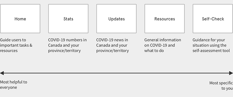
Reassuring users through the style, imagery and language
Due to time constraints, we moved quickly from paper sketches to high fidelity mockups for the development team to implement in parallel.
We strove to use imagery, language and styling to not only give users confidence in the solution and the government, but to also provide a sense of reassurance, support and hope.
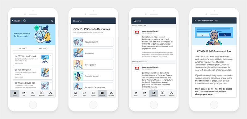
Key areas of the app, as shown from left to right: Home, Resources, Updates and Self-Assessment tool
Building the style guide
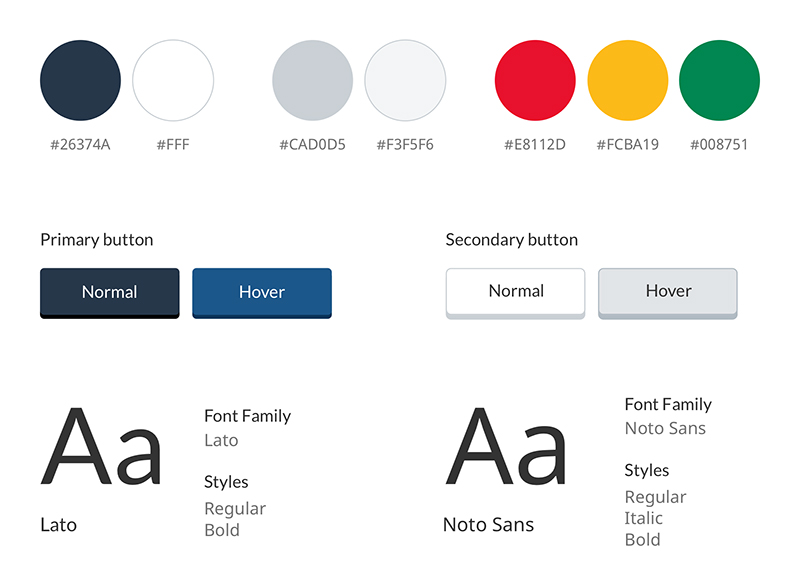
I created the style guide based on the government's brand guidelines, and also ensured that the contrast of colours met the WCAG accessibility standards.
The outcome: Over 100,000 Canadians using the app and finding it helpful
Over 100,000 Canadians downloaded the app, and we received several reviews that users found our solution extremely helpful during the pandemic.
A good app made by government that works
I am amazed by the overall quality and user experience of this app. A must have for all Canadians during this pandemic.
Handy Hub for Key Info
Easy to use, this app centralizes important information. The health check tool provides a great summary of symptoms. It is simple and practical, with links to trusted information sources, including federal and provincial government sites. Very well executed in a short period of time!
I have found this app comforting
It really feels like we are being supported in a common sense way throughout this pandemic. Thank you to the creators of the app and to all of the government employees working so hard in uncharted territory to help keep all of us in Canada safe and secure.
Lessons learned and next steps
The number one thing I learned was how to better design with accessibility in mind from the very beginning. For example, understanding how screen readers worked impacted my design decisions on navigation and microinteractions. I plan to continue learning more in this area.
For the next few months, we continually improved on the app based on feedback from surveys, the government, and the evolution of the pandemic. We added new features to help Canadians track their symptoms and also share community support through the Wall of Kindness.
Check out the app
As of June 2021, the apps are no longer available on Google Play Store or Apple App Store, but you can check out the web-based version .

Photo by Rahul Chakraborty on Unsplash
