Personalized Transit Alerts
Enhancing the experience to sign-up and receive relevant alerts
CASE STUDY • 6 min read
Employer
Client
Timeline
Nov 2021 - Apr 2022 (5 months)
Deliverables
Final mockups, design guidelines
How I helped
- Led and oversaw the UX/UI design
- Information architecture
- User flows and journeys
- Wireframes, mockups & prototyping
- Usability testing
- Design guidelines
- Visual design of emails
Results
- Increased usage of alerts and sign-ups
- Increased customer satisfaction in the improved alerts experience
Context: Disruptions in your transit trip
Imagine that you’re waking up on a Monday morning, but then you remember that nothing is the norm today. You injured your ankle over the weekend, and now it takes twice the amount of time to stumble around in crutches. To make things worse, you have a one hour commute to downtown for an important meeting.
Checking Google Maps for different routes, you decide on one that is familiar - catching the bus to a SkyTrain station, and then taking the Expo Line. However, the bus arrives ten minutes later than scheduled, and when you finally make it to the station, you see a sign that says the escalators are out of service.
I need to hobble up the stairs with my crutches?!
After finally getting on to the platform, you relax a bit, but then you hear a blaring announcement: “We are experiencing a system-wide issue on the Expo Line. Please find other routes to get to your destination today.”
Oh my goodness. Could I have been alerted of all these issues beforehand?!
The crowd on the platform begins to stir, but all you do is freeze. You don’t know what to do next.
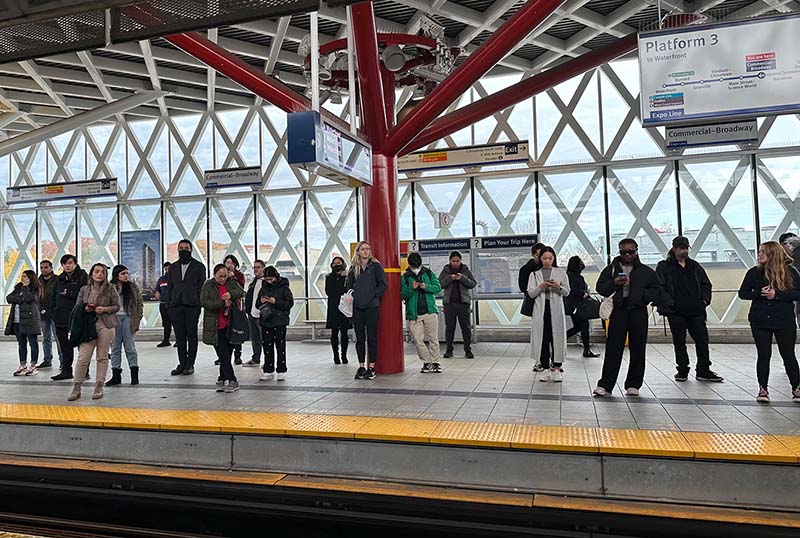
Working with TransLink to empower riders to stay informed through relevant alerts
In late 2021, TransLink collaborated with our agency to improve the experience of riders subscribing to transit alerts. Besides reviewing the current state and making recommendations to improve the overall user experience, the key objective of this project was to also enable riders to personalize when and what type of alerts they wanted to receive notifications for. This included being able to subscribe to specific SkyTrain lines and bus routes, station access updates, and system-wide announcements.
Understanding the current state experience
We conducted a thorough audit of the online platform, focusing on the overarching journey as well as the detailed interactions of the design components. From our analysis, we identified pain points and discovered four areas of focus:
- Initial set-up of alerts
- Personalization of alerts
- Connection to trip planner & active alerts
- Visual design of the alert email notification
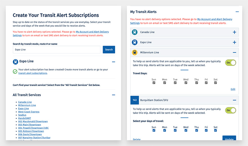
Screenshots from the current process of signing up for alerts
Learning from other transit agencies
To complement our audit of TransLink’s platform, we conducted a competitive analysis of four other transit agencies and their process of allowing riders to subscribe to transit alerts. We pinpointed moments of delight in their experiences that we could learn from and see how to apply in TransLink’s context, as well as any points of friction that we should do our best to minimize and avoid.
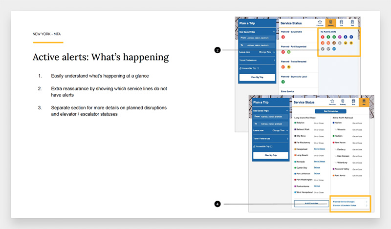
An excerpt from the competitive analysis report
Considering the diverse range of riders and their needs
Based on our understanding of rider behaviours and accessibility needs, we created three core personas: Routine Commuter, Weekend Traveller / Rare Rider, and Accessibility Rider. These personas were used to introduce the ‘Rider Journey,’ which demonstrates a holistic approach in understanding how different personas may be more conscious of alerts at different points along the journey.
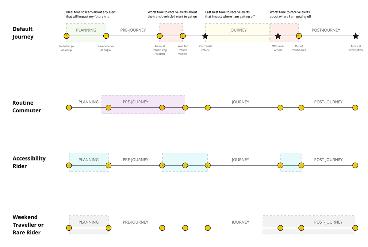
Visualization of the impact of alerts for the different personas
As TransLink serves the entire Greater Vancouver region, it was critical to address the diverse needs of the population from an accessibility perspective. We applied the Persona Spectrum, an inclusive design framework, in this context to keep in mind the permanent, temporary and situational circumstances that may affect a rider’s ability to take transit.
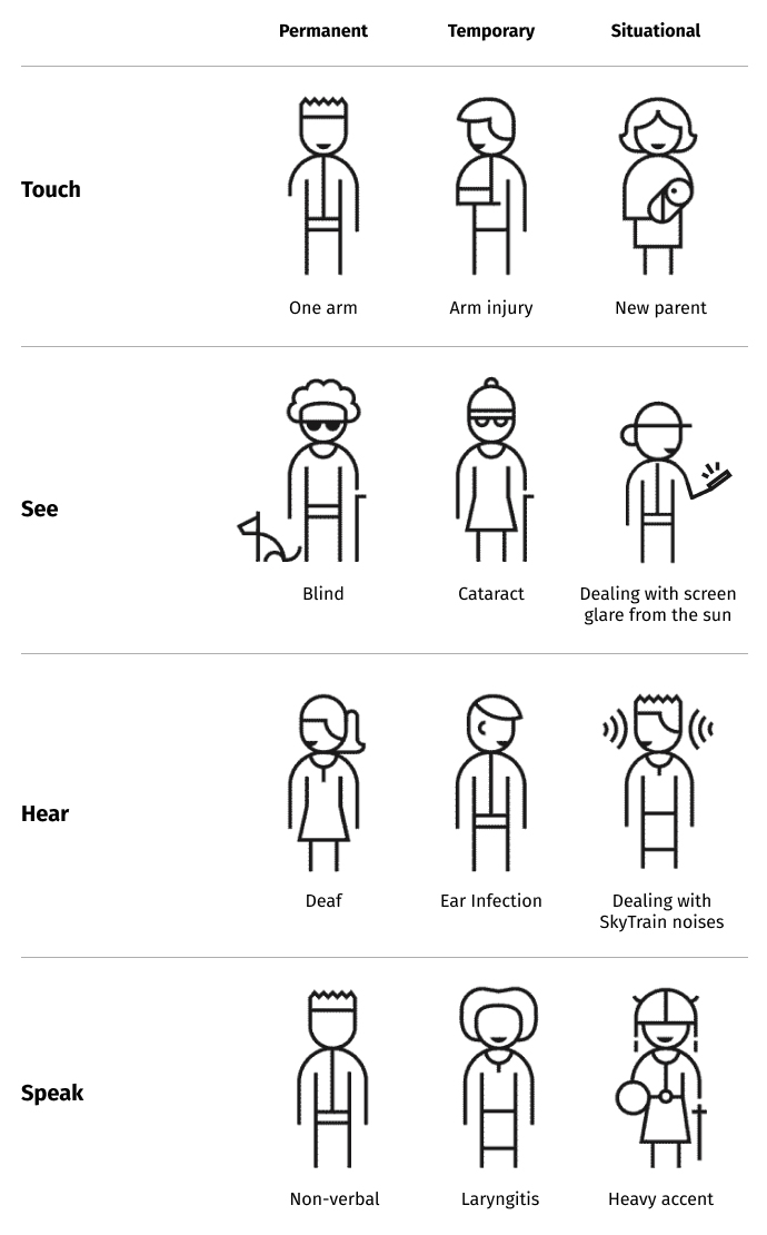
Applying the Persona Spectrum in the context of taking transit
Exploring different user flows and designs
We created wireframes to explore different user flows and design options that were informed by the insights we had gathered from the audit and competitive analysis. An important aspect of the experience that we iterated on was providing multiple ways for users to search for the alerts they wanted to sign-up for, as users have different mental models of the transit system. We also recognized the need to engage with end users to ensure that the new design was of value to them.
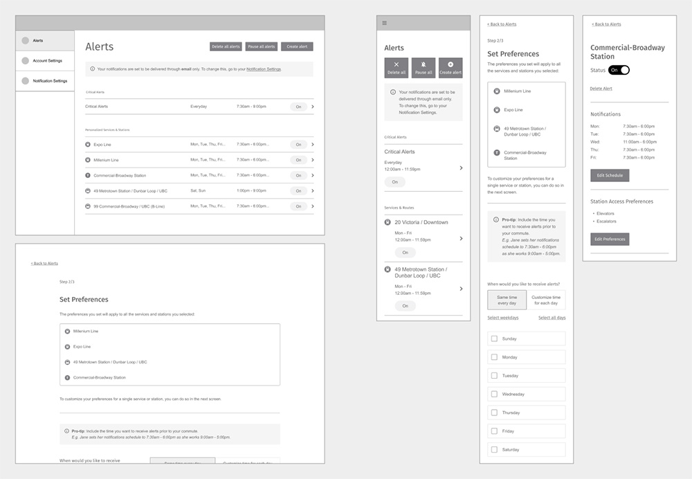
Early wireframes of the new design
Getting valuable feedback through prototyping
Therefore, we recruited 13 participants through TransLink’s customer feedback group and conducted remote user testing with an interactive prototype through Zoom. The session consisted of task-based instructions and scenario-based questions to test the flow and ease of use of the newly designed experience.
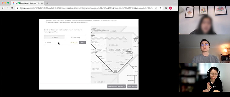
Screenshot of one of the Zoom interviews
We reviewed and analyzed the insights, which led to actionable design tasks and recommendations. A key insight was how in the initial designs, the flow was very linear and every user had to go through all the options available. However, the feedback we received from participants was that they expected the sign-up experience to be personalized based on the type of alerts they wanted to subscribe to, and that they shouldn’t be forced through every step. This led to our final design iteration of a more streamlined, dynamic, tailored experience based on the user’s preferences.
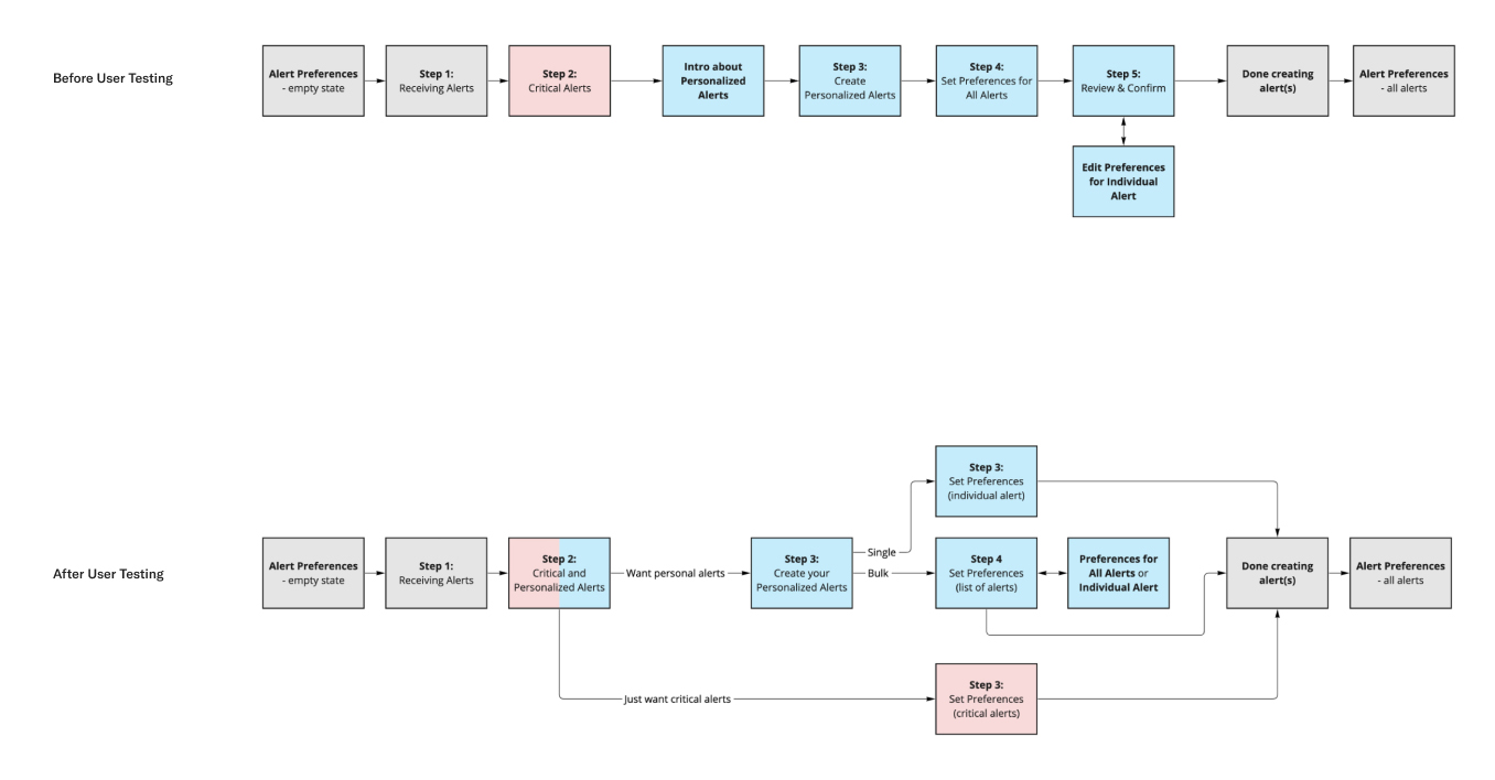
Designing a more streamlined experience after receiving feedback from user testing
Final designs informed by customer insights
Based on the insights from user testing, we introduced changes to the user flow and design, and created high-fidelity mockups to show the final user experience. Moreover, we recommended new or improved design components based on best practices in UX and accessibility. This was all documented in the detailed Design Guidelines document that we created for TransLink’s development team to reference.
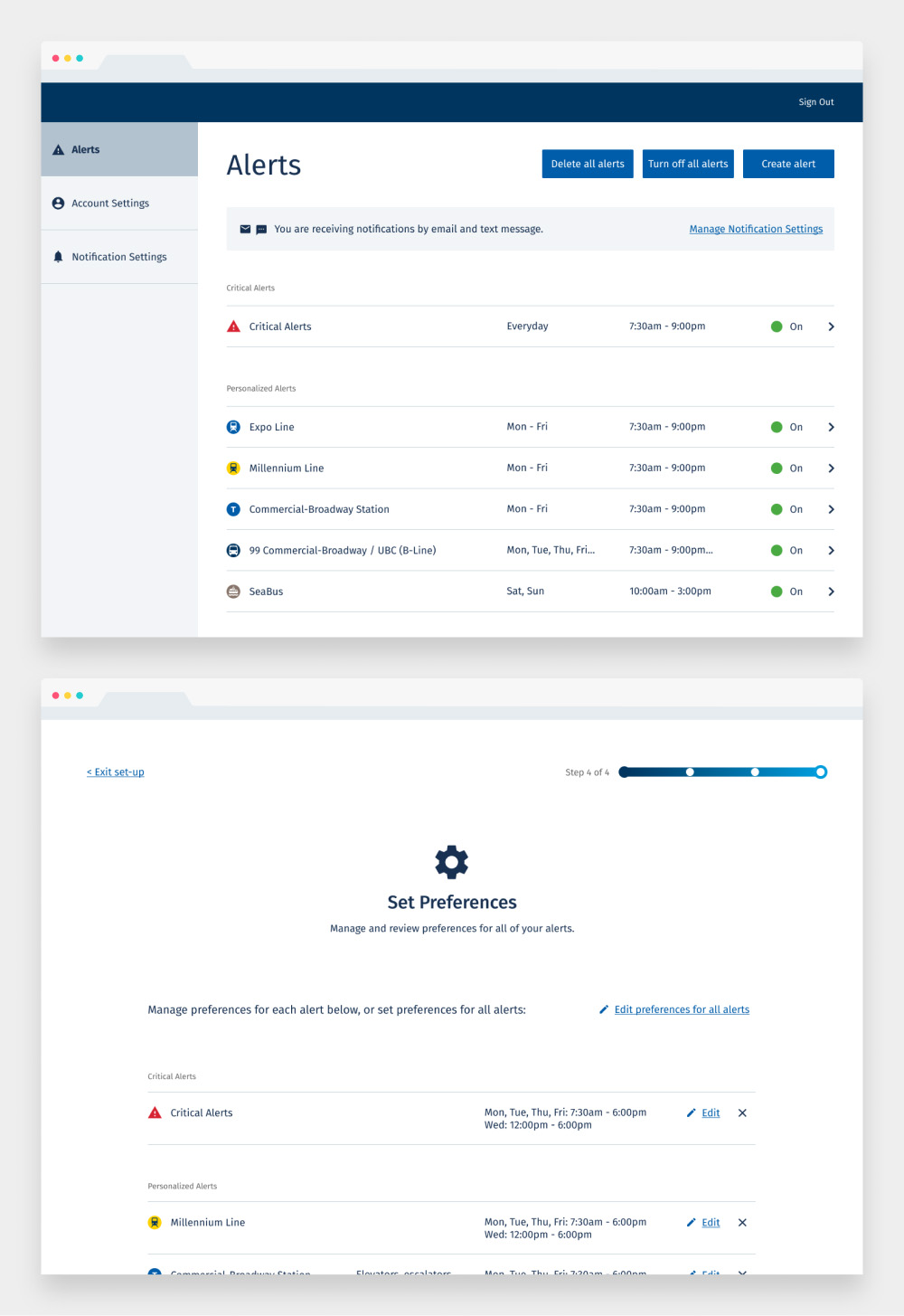
Final desktop mockups
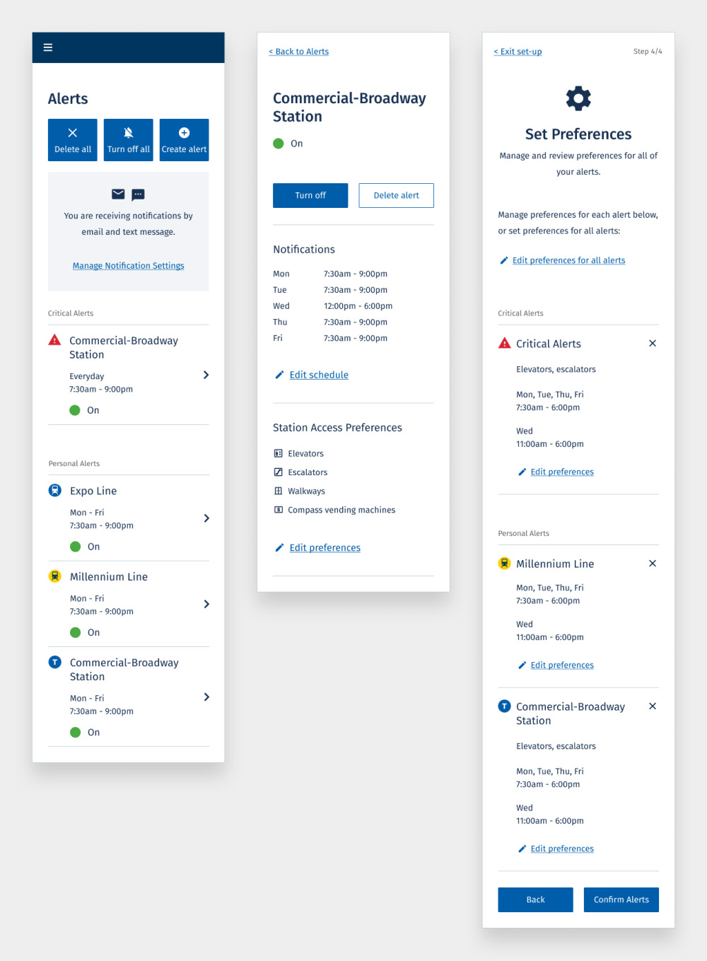
Final mobile mockups
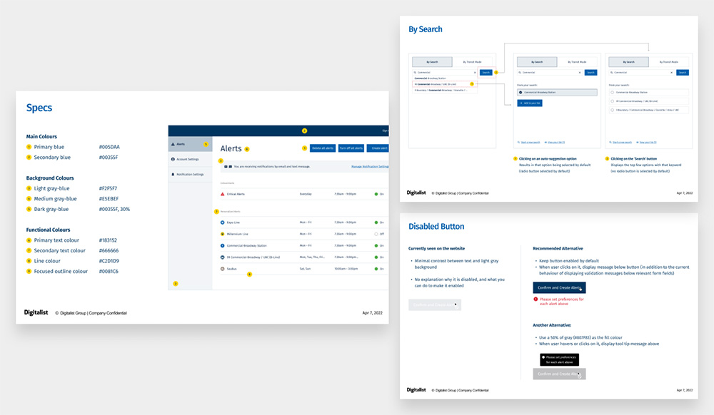
Excerpts from the Design Guidelines document
The outcome: Increased usage and customer satisfaction
We were notified by the TransLink project team that they implemented and launched phase 1 of the new designs in fall 2022. It was so amazing to be able to login to the platform and see the new designs implemented, and to hear that riders were delighted to be able to personalize their alerts - which led to an increase in customers signing up to receive alerts.
Lessons learned: Speaking to the value of user testing
I learned from observing my colleague that advocating for usability testing is not about delivering an articulate, direct, one-time message to the client. An effective approach is to continually ask ‘why’ throughout the project, as these questions enable the client project team to see where there may be gaps in our collective understanding of what brings value to users. This leads to opening up channels for further context building through targeted research and user engagement, and ultimately demonstrates how the success of a product is directly correlated to designs being informed by customer insights.
Check out the platform
Create an account and go through the experience of signing up for transit alerts on TransLink’s platform!
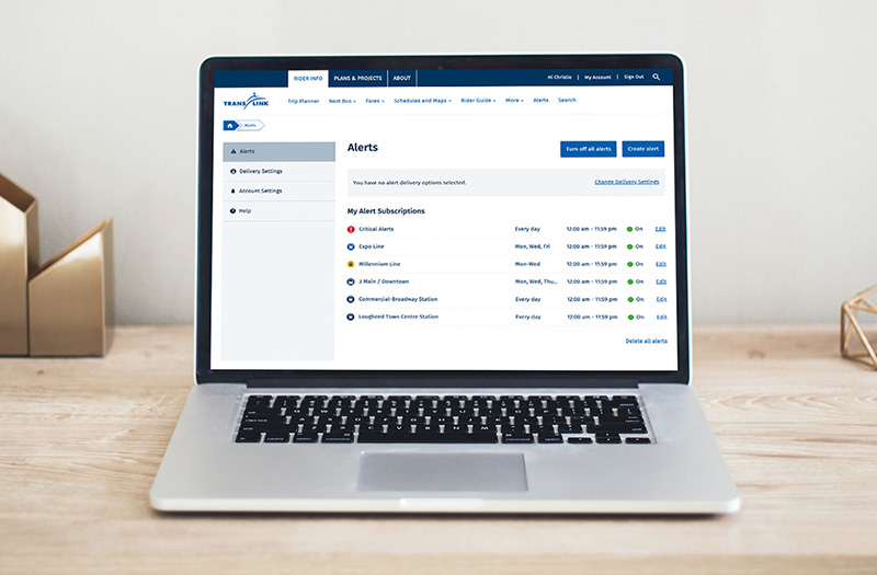
Photo by Campaign Creators on Unsplash
